How To Use Copic Markers UK
A Complete Guide, Tutorials, Ideas & Questions Answered.
Article By Adam Rushton | Site: Big Red Illustration

Let’s Get Started
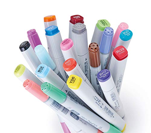
There is a broad range of different markers out there. You could walk down to your local art store tomorrow and pick up a set of 50 colours for £15, or you could end up spending more than that on a pack of five.
Copic Markers tend to be towards the latter type of marker. In my experience, they’re incredibly high quality and are built for professional artists rather than picking them up as stocking fillers during Christmas. They have a guaranteed 3-year shelf life which makes them good value.
Disclaimer – This website contains affiliate links. If you find the information useful, click on a product link and make a purchase, a small commission will be earned by Big Red Illustration
Compared to cheaper markers, Copics allow you to create art that is far more varied in layers, image, and colour. These pens have different nibs that allow for different stroke effects and line-work, as well as a variety of refill ink that not only lets you mix up your own shades but means that you’re never really going to have to replace the Copic marker itself; you’re just going to have to refill it.
Given that Copics are created for artists towards the more professional end of the skill spectrum, there is a little bit of information you need to know to use and blend a Copic marker to its full potential. That’s not to say that all artists can’t use these markers including beginners, though, because they certainly can. Just because the quality and price are on the higher side of things doesn’t mean that Copic pens are exclusive to a small percentage of people.
Having said that, we do need to address the price. For most of you out there, you’re not going to have £200 to drop on a set of Copic markers, coloured pencils, or anything but rent, really. The price of a big pack of Copics could feed a family for a week, and that’s only for a fraction of the marker colours available. So, it’s not a small investment.
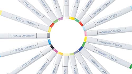
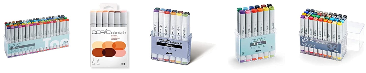
Thus, rather than going all out for a massive set, we’re going to recommend you buy 12 individual types of Copic marker. These 12 give you enough of a base needed to do your art with a variety of colours and a range of textures without requiring a massive kit.
Videos
Colouring
Firstly, get yourself four of the primary colours. We recommend R29, G05, B24, and Y17 (more on that in a second), but you can get whichever primary shades you like.
Those are the main four types of Copic marker that you should be buying regardless of anything else. Forget about nibs, Sketch marker types, and Ciao Copics. All of that comes after you get the basics down.
Once you have your first four colours, you need to pick up four flesh tones of different shades and four greys. Make sure that you’re not getting colours that are too dramatically different from one another. You’re looking to get a base colour and then get colours that you can use to add textures and shadow to that colour.
If the store you’re shopping at doesn’t have the right markers available, then wait. Copics are expensive for most people, so be patient and pick up the right ones.
Once you’ve got your hands on your first set, it’s time to start using Copic markers.
Videos – Beginners Info For First-Time Users
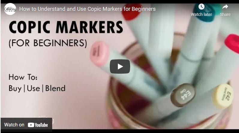
Are Copic markers good for beginners?
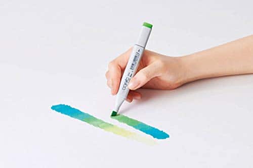
Copics are so great because they are alcohol-based markers. Compared to coloured pencils or other non-alcohol-based ink, Copics blend far better, giving you more range in terms of what you can create with your art.
However, alcohol Copic ink means that the ink is heavier than a lot of cheaper brands. If you buy yourself Copics or any alcohol solution markers, you’re going to be disappointed when your markers start to tear and bleed through the paper or colouring pages.
Colouring Pages
To avoid this, you’re going to have to get paper specifically designed for alcohol ink. This paper can be any brand that’s built to deal with heavy ink that’s meant to blend, but we’re fans of a type of paper called bleeding card.
This paper completely stops the colour seeping through the page and is great for getting a range of shades. If you can’t get your hands on this kind of paper, use a thick card. There might still be some bleeding, but this is going to minimize it.
How do beginners use Copic Markers?
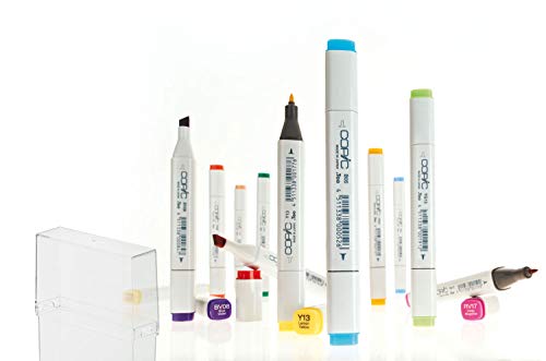
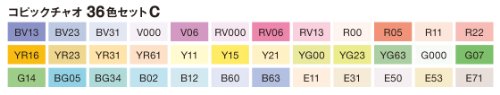
Copics come with a learning curve for any beginner. There are four different types of products, each with different dimensions, a different tip, as well as different initially available ink from the 358 colours Copic offers.
What is the best set of Copic markers to start with?
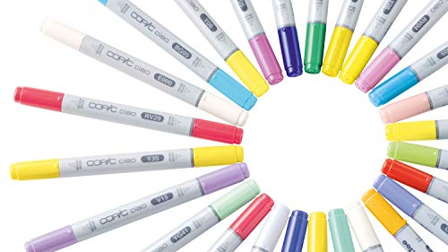
You have the following top products – Classic Copic, Ciao Copics, Sketch Copics, and Copic Wide. Each of these marker types has different pros and cons associated with them, as well as different prices. For a beginner, Copic Ciao markers would be your best bet for getting a range of colours for a good price. Of course, Classic is also always a good choice.

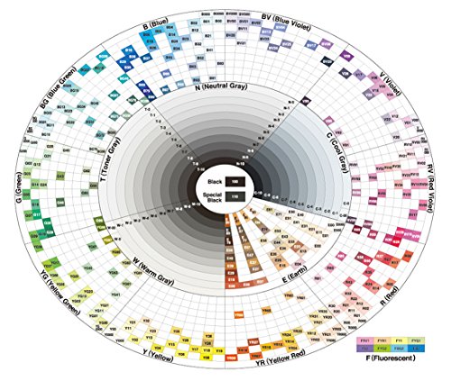
Copic colour system information guide
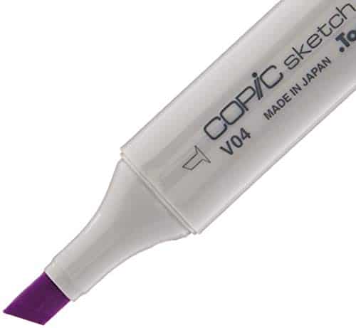
Once you start looking at buying a marker, you’re going to need to learn how to read the Copic colour system. Copic marker colours are made up of three digits you need to read. The first digit is one or two letters that represent the colour family that the marker belongs to. The second is a number between zero and nine which represents the colour saturation of the marker or the intensity of the colour. The last number goes from 000 to nine and indicates the brightness of the colour.
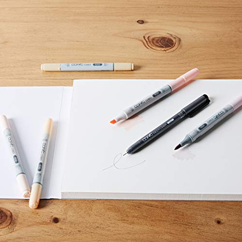
As well as that, you should be aware of the different tips or nibs that your marker has. While each of the Copic types has different built-in nibs, they are replaceable, so just because you break a tip doesn’t mean you need to buy a completely new marker.
Copic markers come with a big art learning curve. You can create great art out of the box with them, sure, but a Copic marker set has a much greater range of ability.
When you start colouring, you’re going to notice that it’s different from classic markers. Copic markers can be tricky to use, especially when it comes to getting an even colour distribution. Being alcohol markers means that the ink on these markers dries differently from other sketch markers.
Rather than colouring in strokes, use a smaller and more controlled technique. Colour an area in small, even circles, or use quick line strokes. If you can, work while your Copic markers ink is still wet. Otherwise, you’re going to find blending tough. Watching the video classes on this page for further techniques is a great idea to get you started.

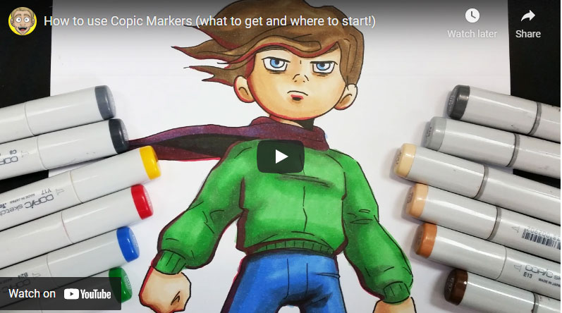
Videos anime information

Copic Markers For Anime Drawings
When we recommended you get a set of 12 Copic markers, we were aiming to give you as much art range as possible. With a combination of tones, primary colours, family colours, and greys, you can create almost anything you want to, including anime or manga illustrations.
Even if you need to find a shade of a colour that you don’t have a variety of, grey markers can be used as a substitute.
For anime or manga illustration, we recommend the following Copic art markers for the skin:
Colour Code Guide
E00 as a base.
R12 as your shading colour.
E04 for shadows around the neck and hair.
As well as these three marker colours, using some whiteout fluid corrector along with a pencil is going to help you add reflections and detail to your art, particularly around the eyes. Alternatively, you could use a brush nib Copic Sketch marker for this.
When you’re blending, you ideally want two markers that are in the same colour family and between one and three intensities of each other.
Start off with your base colour and colour in the area that you’re working on. Given that Copic Sketch markers are alcohol markers, you’re going to want to start blending before the ink has dried. For that, use a darker shade from the blending group and apply quick strokes to the area you’re looking to add shadow too. Use circles and avoid the use of zig-zag strokes to ensure a smooth finish. Once you’ve done that, go back over it with the lighter base shade and drag the dark ink out to get a gradient.
You should also consider using the Copic colourless blender marker. This colourless blender has white ink and is great for both adding details as well as fixing mistakes and adding textures to your paper. If you do use the colourless blender marker, you have a few different techniques that you can use.
Ideally, though, you should go over the entire area with it before you go in with your Copic Sketch marker. Then, while the alcohol-based markers and ink are still damp, go in with your darker colour making sure you’re using markers that are in the same colour family. Following that, you can use your Copic Classic markers, Copic Wide, Copic Ciao markers, or Copic Sketch markers to add the lighter details to your page.
That’s how to use Copics in general. For anime art, there are a few general tips that we can give you.
First, light is very important. The difference between professionally coloured manga work and that of an amateur is that the professional knows how to use it. Copic markers are built to help you with stuff like this, so make sure you’re taking advantage of your tools.
When you’re colouring, recognize where the lighting source is for the character or background on the page. Use a Copic colour that compliments the style that you’re working with, and make sure you have the markers needed to add shadows.
When you’re applying your base marker colour, keep areas of the picture white to reflect the direction and intensity of the light, particularly on the hair of your character.
Lastly, you don’t just have to use your Copic art markers for shading. Don’t be afraid to use some light pinks to add some blush.
Looking To Purchase Copic Markers?
Read All About The Best Copic Markers here!

How do you use alcohol markers for architecture?
While Copic Sketch and Copic Classic markers were designed for artists and illustrators, architectures and interior designers can also get a lot of use out of them.
For these professionals, it’s far less about the range of primary colours as it is the ability to use your Copic markers and colourless blender to enhance shadows and elements of design.
This makes the Copic marker process for architecture different from the one for illustration. With this difference in technique also comes a different Copic colour need.
Rather than looking for a colour family range that gives you reds and blues and greens, you’re going to want to focus on getting high-quality greys with different nibs. Having a range of tips, whether broad, chisel or a super brush nib, is going to give you greater control over the lines and layers you draw on the page, letting you bring the details of your idea to life through the drawing.

What markers do architects use?
When you go to purchase Copic markers for architecture, there are 15 different markers you should consider getting first. These 15 consists of lighter and darker greys that give you quality and smooth control on your page rather than just colouring the image:
Copic colour system guide – useful colour code information:
Warm Grey 1.
Warm Grey 3.
Warm Grey 5.
Warm Grey 7.
Warm Grey 9.
E43.
E44.
E15.
E55.
E57.
B52
B95.
B97.
Y25.
YG67.
This collection of hues is going to give you a range of saturation for both dark and bright colouring. Combined with different marker nibs and the correct smooth colouring techniques, your drawing is going to be seamless.
When you’re using your Copic markers for architecture work, you need to follow the same colouring principles that we talked about earlier in the article. Make sure you’re blending out your edges bit by bit, and don’t be afraid to use the colourless blender.
You can be generous with your ink as you’re not going to need to purchase your collection again. If a marker runs out on you mid-image, you can order a refill ink bottle from a number of different places online.
While you might struggle to find all 358 colours in the same place, you shouldn’t have too much difficulty if you know what you’re looking for.
As an architect, making sure that you’re using the right tip or nib, as well as the right paper, is more important than it is for someone just looking for a set of colours. Regardless of whether you’re showing the piece to a client or it’s for yourself, you need to be more precise with your lines.
If you use regular paper, not only can that paper rip and tear, but it can also bleed. The last thing you want from a drawing you’ve put effort into is for the paper to get destroyed afterwards.
When you purchase your Copic marker collection, we recommend you have a look at what nib replacements you can get. Get at least one chisel and one broad nib. Make sure that the tip or nib you buy can fit your barrel.
The barrel on a Ciao Copic isn’t the same as one on other Copic markers. So if you have a Ciao, you’re not going to be able to use a nib made for a Copic classic.
Copic Markers for Skin Help Guide
For anyone not interested in architecture, it’s not unreasonable to assume you’re going to be using your colours for skin at some point.
Skin is a complicated beast, as any artist could tell you. It’s full of different colour tones, hidden lines, and plain areas, and is massively impacted by shadow. Therefore, using Copic colours on an image is an entire process in and of itself.
Rather than focusing on nib type, forget all about barrel dimensions, chisel, broad, or super brush tip options. Don’t fret over using professional-grade paper, although do use thick card paper if you can. Ultimately, though, all that doesn’t matter here. For your purposes, it’s all about what Copic colour you’re using for your colouring.
If there’s one thing you pick up from this article, it’s that saturation is the key to getting a good-looking blend with your colours. It doesn’t matter if you’re using blue or yellow; that saturation number dictates everything, so make sure you have the right range of colours before you start.
When you start colouring with your base, avoid putting any colours where the sun is hitting the face. Establish where your lighting source is. After your Copic colour base is down, go back over it with your darker Copic colour to further establish your lighting source as well as the position of the head. This is going to require a mild understanding of how the head is shaped, which you’ve hopefully come across at some point in your artistic career.
Where the lighting highlights hit the skin, go back in on the page using a blending brush nib. At this point, add some darkness under the character’s bangs, bottom of eyes, and use this time to shape your character’s nose through blending. Don’t forget about the base of the neck, too.
Then, you can use a marker that’s darker again for pure shadow rather than as a blend. Certain blue ink refill number options work for this, but greys are always going to be the best.
You don’t need to add many shadows, just deepen the neck and under your character’s hair.
After that, get your broad or chisel nib and start adding details to your drawing. Remember to make sure that your barrel number fits. A chisel or brush tip for a Classic isn’t going to fit on a Ciao.
Blend and layer as you go and use all of the colours available to you. Make sure you’re following the artistic techniques that you already know, and you’re going to have a stellar drawing in no time, all done using Copic markers.
Affiliate Disclosure
In compliance with the FTC guidelines, please assume the following about all links, posts, photos and other material on this website:
Any/all of the links on this website are affiliate links of which The Big Red Illustration Agency receives a small commission from sales of certain items, but the price is the same for you.
www.bigredillustrationagency.com is a participant in the Amazon Services LLC Associates Program, an affiliate advertising program designed to provide a means for sites to earn advertising fees by advertising and linking to Amazon.com & Amazon.co.uk. Pages on this site may include links to Amazon and its affiliate sites on which the owner of this website will make a referral commission.
Cookie preferences: cookie preferences


Adam has made a name for himself in the illustration industry and is a passionate blogger and writer on the subject of art, illustration and graphic design.
His artwork has been featured in countless publications and used for very well-known media projects. As a professional illustrator for over 20 years, Adam's wealth of knowledge and experience enables him to consult and advise artists and illustrators all over the world.


